28.2.13

Too Long... Too Long...

I worked for at least three hours on this hair for HAUTE:
(click image to enlarge)

What do you think? I personally really like it, especially considering it took me such a long time to get the hair strands just right. I still have to add some dip-dye to it, but other than that, I'd say this is pretty fabulous!

I hope you'll all love it as much as I do too! Please comment!

26.2.13

A mousemade Graphic!

At last a somewhat creative title!
So as said This new graphic I made is completely done with a mouse!Check the graphic out:
I know I haven't added the details to the face! Its okay to slip something out in a completely enlarged image!
the actual graphic is the one with my banner. Anyhow talking about the graphic .... I think I like it. Its pretty good . I mean like there's no other complaint for me other than the hair. But I purposely chose black since most of the native and Indian south Africans have black hair! Gotta practice with it! But personally I like the whole graphic which is why I turned it into a banner for my graphics blog. Here's the banner!:
So what do you think about my completely mouse made graphic!?
Anybody care to comment!


25.2.13

ntgd task 3 graphic

seeing as everyone else is posting theres i thought i would share mine


imo this isn't my best work and i think it's because i had to channel someone elses style instead of my own, i still think theyre both cute though

i also want to say thank you so much to all the people rooting for me whilst i compete in ntgd it means the world to have this much support and without it i probably wouldn't be top of the leaderboard right now <3 ily all

byee queens xxxxxx

All Business-


I love this so much!
No regrets.


24.2.13

Graphic for MissFoxyRoxy913

So, after nearly two weeks of procrastination, I finally decided to finish my latest request for MisFoxyRoxy913. She wanted a graphic for her newest blog, The Scene on Stardoll.

I'm actually really quite happy with the outcome. The only complaint I might have is the collarbone and the shirt shading. They both are a bit darkly shaded, but it looks fine enough.

On the other hand, I love those shorts! I think I pulled off the ripped effect quite nicely. The background is simple, but nice as well.

With that, what do you think of it?

My SDNTGD Task and a New Graphic!


This was my SDNTGD task entry.
 I got third place for it (even though I kinda thought it was the best-personal opinion of course and no offense to the other beautiful graphics:D) 
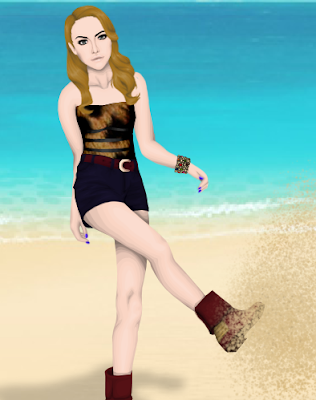
and I have to say I really love it. the shading is amazing, the whole idea of Summer-Grunge going on here is totally obvious and that was the point. The Model really loves it, so that's all that matters. She's happy so I'm happy. 
That's what matters at the end of the day. If you can make one person happy, you've accomplished a LOT!

My favorite part of this are the boots and hair. The boots were THE HARDEST shoes I've ever done, but it paid off. The hair was actually something I started on a long time ago but never finished, but I thought it worked nicely with the graphics. I love the bracelet so much, I used it in three other personal graphics of mine. The backgrounds is actually a room in her Suite which I thought was pretty cool. It worked well with the concept behind the graphic.
Model is iluvladygaga232


I worked on this about a week ago and forgot to post it...
I really love all aspects of this. It's totally retro and modern at the same time. I'm not the best at doing knees, but even I've got to say that those knees are the bee's knees! Not so sure on the collarbone/clavicle area, but I still like it! 
I just really love everything about this and I hope you guys do too!
Model is AudreyxBeth

So that's it.
 Any questions or comments, don't hesitate to ask!
Thanks!

Teen Vogue Spoiler

Hey Guys, I've been super busy with Teen Vogue and I can reveal it's coming very soon!

Here is the official spoiler;


click HERE to go to the blog
At the moment we only need 10 more followers until we reach 100!
as soon as we do, a massive raffle will occur and 1 lucky follower will win 100 sd!

please follow the blog!

also, do you like the graphic?
Khol X


SNTGD task 3!

Hello readers!
I know am showing the graphic first and then explaining however....the graphic is odd...I don't understand . The tasks I do for SNTGD sucks while those I do randomly turns out to be way better than the tasks . Take for example my toxic spoiler. Thats better than this! hmmm anyhow I gotta try better for my task 4!

23.2.13

My 3rd task for SNTGD

I know, it's been a long time since my last post.
I'm sorry ...

Anyway, here's my entry for Task 3 of SNTGD. I know, it's not my best work, it looks kinda rushed, everybody hates the dress, blah blah blah ...


I'm kinda disappointed myself, too. I mean, I've worked so hard on this, and I really tried so bad to make it something special, but I somehow couldn't manage ...
I think my skin shading needs a lot of improvement, maybe I should add some more layers? 
I also don't like the collarbone, it looks awkward to me. I'm pretty proud of  the hair, though. This happens to be the only thing I can do really well these days. What do you think about it??

I guess I won't be able to win SNTGD if I keep doing graphics like this, but let's be honest. It's gonna be Jack or Luisa anyway ...

xoxo Rafael

FINISHED!

Hello Everyone! I now know the person who has copied all of us! I am very frustrated, i did not and never will give my consent without knowing! Grr.. Anyway, I have finsihed the graphic that I have done! And, NO you may NOT use this piece ANYWHERE as i will be using it as a BANNER!


Sorry If I'm sounding rude or anything.. I just HATE copycats! And I'm sure all of you GD's hate them too!


...???


NO COPYING!


xoxo Emma LOL

21.2.13

Maybe You've Seen This Before?

Ah well, it isn't quite a surprising thing when you notice people using your graphics...

Today, I visited a person's blogger to see what blogs they participate in and I noticed this:


Notice anything familiar, fellow GD's?
Yes, the header is Emma's graphics(from her blog)
The side picture was my second entry in SDNTGD
The ninth post was, I believe Eamonn's graphic from one of his lines
and so far, that's about it.
HOWEVER, even if the graphic designer does give permission to use the image, there should always be credit. I didn't give anyone permission to use mine and I'm sure Eamonn and Emma didn't give anyone permission to either.


scrapped x graphic

as said in the title the following graphic was made for x but is now scrapped because i totally changed my mind about the featured designer for this issue

so here you go


the model is the gorgeous lovegossip4life

i dont even really like the hair nor do i think this graphic fits in with the theme of x

if you want to use this for your own project then feel free but you MUST credit me


love ya xx

ps: i am now queendetox on stardoll in case you were wondering/care

20.2.13

Spoiler ready!!!

Heya!
That's right.. spoiler for toxic is ready!!!! What do you think of it.....I think the jacket's seriously odd other than that ummm I think I like the graphic overall, especially the face :P
Hers's another crap :
As I mentioned...It is crap !! :P It is barely completed :P
So what do you think? Tell me about the spoiler... :P
OH AND DON'T FORGET TO FOLLOW TOXIC...CLICK HERE!!!

Update

Hello!
 WOW it's been a while since i last posted! And I'm so sorry for that. I have been so busy! But here is something that i have BEEN working on...

click to enlarge


So.. What do you think of it? Have you guessed what it might be for? ;)


xox


Emma

19.2.13

drag generation

if you know ANYTHING about me you'll know i have a passionate undying obsession with drag queens, and said love has inspired me to make a graphic of my current favourite queen "detox ic**t"


click to enlarge for best view!!!

there's still a LOT to do on this graphic but i was mainly focusing on getting the face finished for today

before you start to think of things wrong with this graphic click here to see the photo of detox i used for reference and THEN make a judgement (unless your a drag race fanatic and your already familiar with her face)

anyway i personally think i did a good job and captured her spark
but what do u think? COMMENT AND CLICK A BOX!!

mwah ly xxx

100% Me!

So, after being an awful promise maker, I decide to shy away from a graphic request (you'll hopefully see it here soon!), and make a graphic of my own. And boy, was it a success!

I wanted to try and make a graphic using NO reference picture what so ever, and I think I succeeded (do you think?). Anyhow, enough rambling, here it is!:

So maybe I was sort of inspired by Kasey's graphic with her legs, and decided to make my own. Normally, I'm horrible at making my own shoes, and these ones I think came out at least half way decent. And yes, that is my signature! I decided to take out my tablet too, but the writing is the only thing I used my tablet for. The rest was done by mouse.

Anyhow, I really love the pants, and I'm not completely sure I like the shirt, but it'll do for a practice run.

I personally think once you've been able to make your own poses, no refrences at all, it definitely marks the beginning of something great. And something even more fabulous?

I didn't even draw a pose (as in pencil and paper, then scanning image to computer), I just made it pretty much using my imagination. I'm quite happy with that fact as well.

So, what do you think? Was it not a complete fail?

Oh, and if you haven't seen my work for V&K already, here's what I finished in mid-late January. Here's the poses I made:


If you want to uuse the poses for making outfits and hair, I don't really mind, AS LONG AS YOU give credit to the poses. Oh, and please don't add these do your blog banners/whatevers. Or else... :P

Thank you for reading my rather long post!

18.2.13

Its Toxic again!

Hello graphic lovers!
How are you all doing? Hope everyone's well! Anyhow lets skip to the part where I show my graphic :

(click to enlarge since this one is too small)
Introducing you to Toxic magazine ....Dont worry this issue is going to be out even before you know :P Just kidding.....anyhow I hope ya'll follow the magazine....:D
to follow click HERE :D

Anyhow what do you all think of graphic???? Is it good....please tell me? Will you.....
PLEASE COMMENT!!!!
*An apology to Khol since i wasn't aware of it.....well I was but forgot *

Leggy

Sneak Peek into a recent graphic I made. I REALLY loved the legs so I decided to showcase them. I honestly love my shading technique:) 
It really works well with me and I feel really good about them.

17.2.13

x magazine rated

im not sure what the standards are considering nudity or whatever on this blog but i made this graphic and i want to share it with u all


its not even THAT inappropriate its not like theres nipples or anything

but yeah this was a LOT of work and i think it turned out pretty good

opinions?? leave them in the comments! and click a thing too

lots of love and drugs xxxxxxxxx


(ps ik this is cliché but please CLICK HERE and vote the latest task or whatever in my yearbook pls lmao thank u)

16.2.13

anglophile apologies

sorry for not posting in a while, but i was recently celebrating chinese new year in my favourite place in the world: london! i hope the year of the snake brings you all the crap you wish for!

anyway moving on

the production of x magazine is now in full swing and a lot of graphics are complete, a few articles are also coming along nicely (thanks to my suave writers)

but what i want to share with you all today is a rejected graphic featuring the face of the lovely chufu


im not sure exactly why i dislike the graphic but theres just something about it that throws me off, although i do like the face and dress shading

what do y'all think? leave your opinions in the comments and remember to click a box!!

(also just gonna plug x again because i can FOLLOW X MAGAZINE!! CLICK HERE!!!)

BYE LOVE U

Cara!


Made this yesterday...Love it so much I've got no bad words about it.

14.2.13

Graphic :)

hey readers :)
As I promised.....i did do a graphic..and guess who won it?
Thats right...dubistdie!
Well I sure do hope you like it.....:)
plus...here is a graphic i did for Allure magazine :-
Make sure to visit allure...its by one of my friends Tania :)
Well what do you think of both the graphics.....???


Mermaid

This is not a picture of a mermaid.
 But Train's recent hit, Mermaid, inspired me to make a graphic, 
which is why Mermaid is the title.
The model is Kasejen(my other doll)

The sweater is my own design.
The only thing I don't like about this is the right pointer finger. 
It's awkward.
But, I mean, everyone makes awkward fingers at least once in their life.

What do you think? Please give me your opinions.

13.2.13

A sign of life

Just a quick and rushed graphic I made today in my freetime - just to tell you that I am still alive! haha
Had a very fun last week with celebrating Fasching which ends with this wednesday (Ash Wednesday).
Now I am super dead tired and fed up with 'Alaaf' or 'Helau'. Oh well, good night! xx

Two Hours Later...

*Jaw Drops!*

yeah, I amazed myself. Two hours and that's IT! I'm really happy with this and I think it's sooo beautiful. The shirt is so clean and the collar is such a cool little detail. I'm really beginning to expand my art(into painting and sculpting) and I think that's really helping me further into my skill level. 

Right now, I'm working on a HUGE piece in my art class, but I'm gonna try to get out a few more graphics later this week and weekend.
Hopefully I'll be able to post my SDNTGD entry, because I really, really like it! 

So yeah, that's about it:)
Thanks:D

12.2.13

The Artist

(As usual, click image to enlarge)

Inspired by both The Voice, and American Idol (american television programs ;)) I decided to open up my own graphics competition, "The Artist."

Using a rather old graphic I made (if you call a graphic made in December old...), I used it in the official banner for the competition. The model is something I just pretty much made on stardoll, so its no one special. I actually quite like it, although the hair might be a bit too bright for some eyes, I like it. And the flower doesn't have much depth to it, so I know...

Anyhow, if you'd be a dear, and follow the blog, that'd be amazing... just click HERE! Awesomeness ;)

11.2.13

Surprise!

Hey readers :)
Just a quick notification...Its my birthday tomorrow...and I was kinda thinking of doing a graphic which you would like to see from me!.....My photoshop is back!..Well i was kinda having some problem with it..anyhow...what graphic would like to see from me..if you want I can do a free graphic for anyone of you too! But only a lucky commenter will get it!
So keep commenting..... :)

Graphic: UPDATED!


EDIT:

Nobody besides Lindsey questioned the reason I posted an old graphic? Just a bunch of "Not my Style"'s
Well, I did this to see if people actually paid attention to my improvement. Thank you Lindsey and if I had seen Kim's comment, I probably would of thanked you too:) (so thanks:D)

Here's the most recent graphic I've made. 

Hint: The Bracelet will be featured in my SDNTGD task entry:) But just a little more zoomed in.
See improvement? The graphic on the top of this post, I made almost three years ago. While that's a long time for improvement, I only ever made graphic once a month because I did not have a tablet nor did I have Photoshop, so it was a pretty big hassle to make them. 

So can you guys see what I see? It's a pretty good idea to look back on your first few graphics. 
It helps show that you have improved and that all it takes is practice.

Thanks:)

8.2.13

old habits

i promised myself that i wouldnt waste time making faces for x but oops look what happened


i have NO idea who the model is but i know its from a alexander wang spring show

anyways opinions???
dont forget to click one of those things too idk what theyre called but click one!!!!

bye mwah xxxx

Graphic

Hey readers :)
Just a quick post ......I made new graphic:
Tbh I hate the whole graphicl...its just a rushed crap that's it....But I wanted to know if this opacity thingy is good or not...let me show you the real graphic without the effects!
So what do you think about the opacity change in my graphic?
Like it or Dislike...
Please do say me!

7.2.13

Long time! + Teen Vogue

Hey guys!
I'm so sorry I haven't posted recently, I've been verryyyy busy with Teen Vogue!

I thought I would come a long and drop you some sneak peeks ;)


So, excited?

Also, visit the blog right HERE and please follow!

One lucky follower will win 100 sd once we reach 100 followers!

Toodles!
Khol X


Spoiler for HAUTE

Hey guys! I finished the spoiler for the Spring issue of HAUTE today! Check it out:


I actually really like this. I've never done a tattoo before, which was fun, and I think the graphic as a whole screams "controversy" as the issue theme will be, like it says, controversy.

I know the hair doesn't really look like a braid, so I apologize. Maybe its just a messy style, but idk. Anyhow, please follow the blog here! I'd like to try to get 200 followers before the release, so each new follower means a lot!


OH, and the model is Kasey (martusia_144)... I just loved the idea of a side view, though :D


EDIT:
I added more of a depth to the face, which I think turned out good. I'm not sure, though. You be the judge:

6.2.13

taste it

so i've been doing a LOT of graphics lately especially with x i've just been scribblin em up

here are a few teasers or "tasters" if you will


all tiny and barely show anything i know

but
ENJOY!!!
and dont forget to comment and all that crap

BYEEE xxx


p.s: do you want to raise the amount of your dolly dollars by 100? well you're in luck! x magazine is giving away 100sd to one lucky follower when we reach 100 followers! FOLLOW NOW!!!

4.2.13

Just practice!

Hey Readers =)
I was actually planning to post yesterday but my net was disconencted cuz  the prepaid period was over..anyway here's a graphic that I did on saturday just as a practice for my task 3! Though my practiced graphic turned out stupid...am overall happy with my task.....but....its not yet over :P Am the most laziest person in the world which is why am usaully late at submitting....but most of the time the tasks come out when I have my formative assessments....and this time as expected it came out during my preliminary exams! We have many exams dring an academic year! you must be alreayd yelling "Shut Up Already" so am stopping and viewing my 'not even worth seeing' graphic :-
Ignore the stupid and rushed piece of crap that is the skin! and well the hair is incomplete! :D
But am pretty happy with my clothes....pretty good! what do you think?
Tips? comment?
(Sorry for the senseless grammatical mistakes made)