31.8.12

Bad hair day?

Been doing some work on just hair, so not much to show really =) And I decided I needed a better post title than "Graphic" which mine usually are, and this is the best hair related phrase I could come up with - ha!
I think I prefer the shape of the second one but the shading of the first(think I kinda gave up on the second one towards the end!).
For me, these are pretty good as I'm absolutely rubbish at hair(we all know that!) - over the next days, I'll definitely be working on more hair, I really want to start getting it at least a little right!!!
Love K xxx

Some summer stuff

Here are some unfinished graphics, which I've done this summer:


30.8.12

Unreleased Splendid graphic

Hiya guys, finally it's Maria here.
I've done my last graphic about a mounth ago as a Splendid #3 cover, but I won't use it as a cover now.  Now I'm almost back to graphics, and will be posting more here on graphic vault soon, since I have some 1 mount old unfinished graphics to show. 
The face is my medoll's face which has never been saved on my doll.
My favorite parts are the hair & the necklace. 
Whatcha you think?

-Maria

29.8.12

From space

 
click to enlarge

I've been pretty bored today. I hate having no school - at least after several month of break! blaaaah, hope you like the graphic though. Please comment and rate!

Model: --Kayley

An Issue That Will Never Be.


New portfolio graphic =)

I've been working on improving my hair, and I really think it's going well! I had started this graphic with only planning on actually doing the hair, then I was like "there's some denim here" - denim is on my list of things to work on, so I've ended up doing the whole image! I also decided to work with a different skin technique, which I think also worked out quite nicely, still not sure about the leg - but I can work on that later =)
The head positioning is a bit odd too, but never mind!

So now that it's a whole actual graphic, I've decided to use it in the banner for my modelling portfolio:
I'm super happy with it, let me know what you think of my improvement!

I'll also take this moment to introduce my new graphics project(I wasn't planning on self advertising, but Jem-n-em has below, so why not?) - it's aimed at beginners and new comers to the stardoll graphics world, and presents tasks for entrants to complete and be given tips and feedback on how to improve, it's not like Stardoll's NTGD as it's not an ongoing competition as such, people can enter whichever tasks they like(e.g. you don't need to have done tasks 1 and 2 to do task 3 if you get me), click on the pic below to go to the blog and get more info - the first task was announced this afternoon and lots of interest has already been shown!


Love K xxx

28.8.12

A gift to the owner

Hey Dolls,

So a few days ago I wanted to practice some new graphic techniques and I thought of Ceaaria (This Blog's Owner) and used her doll, After a few hours it was actually starting to turn out great! I'd shown Nika and Kirsten who both really liked it too.

So I am proud to reveal this graphic of our beautiful Graphic Vault owner,  Ceaaria Iman!


So, What do you all think?Please Comment and Rate!With Love, Khol xxxx 


27.8.12

Graphic for Portfolio

Today I decided to give my portfolio a new look, which includes a new banner of course! The graphic below is just the doll I created for the banner. She is sitting on the fonts just in case you are wondering about the pose... The dress is inspired by one of my favourite party dresses from Zara! Anyways, hope you like it :-)

26.8.12

Shoes, shoes, shoes

My latest graphic, it only took my 2 hours so there are a lot of mistakes, but I will sort them out another time
Also the background is supposed to be blurry to bring focus to the shoes
Anyway what do you think?

Is My Makeup Okay?

I'm here!:D
I withheld from doing my reading assignments just for you, so enjoy:)

The hair is a little choppy towards the top, but I really like it:)
Mainly i'd like to focus your attention to shading. Do you like my new technique? Does it seem more realistic? Even though graphics aren't supposed to look realistic, does it look like a good graphic?

I've done the side-view graphic before but I've never posted one, because I'm so self-conscience of those types of poses:P

But anyways, probably going to be my last graphic for a week or two.
 School is beast, but horribly busy:]
Thank ya, darlins!

25.8.12

Just a random graphic..

As you can tell I struggle with finding a decent title for my post. And I'm posting this on the blogger app on my phone, so sorry if it's weird:L
Anyway, I've been working on a graphic and It's turned out okay-ish, it's of my best friend Chantelle when she was pregnant, she was a ashamed (that's why she's covering her face) as she was only 15 but now she's happy with her decision as she has a beautiful baby boy called James.
The shading If a little off and the face is strange as it looks like she only has one eye and no nose but the hand is meant to be covering it, anyway what do you think?

Haute Couture Graphic

Yeah, I couldn't think of a good title, but I think many writers here have their little problems with finding a good title for their post xD
Anyway, I haven't been working on my graphics lately because I'm playing "The Legend of Zelda -Skyward Sword" for Wii a lot these days.I just love love love this game. Okay, that was another uninteresting fact from my life.
So today I finished a graphic that I have started last week and I'm really happy how it turned out. I can't believe I've done the hair in only half an hour. Thanks to my tablet, I ♥ it! Have a look:


Model: Dreamiiiii
I'll be using this graphic for the spoiler for the Haute Couture collection of Spice Couture. I will add a hat with a water lily on it. The graphic is based on my sketch.


So what do you think about the graphic?
And how do you like my design?
xoxo Rafi


New Graphic

Hello!
I've made a new graphic after the work of Toxic..am happy with this graphic than i was with my mag graphics!


There are a lot of mistakes in it as usual but guess what it was my first try for fur and i think it turned out well! at least! :D

Task 3 Entry

This is my entry for task 3. 
For information :
http://stardoll-ntgd.blogspot.com.au/2012/08/task-three-results.html


23.8.12

Graphic

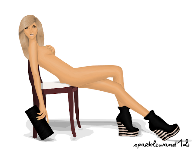
I've just finished this grapic, I actually started it way back in May(which is why the face has one of my older less recent looks), I almost scraped it earlier because of that weird left hand, no matter what I did it just didn't look right, and this was the best attempt! The hairs a bit spew-worthy too, but it's not that bad =) 
I'm happy with the shoes and the bag, although they're both fairly simple I think they came out ok.
But yeah, overall I'm happy with it! I think skin is my forte with graphics, so this sort of image is pretty ideal for me! I couldn't decide on a background, I had like 5 possibilities, but decided plain white would have to do!
 I also did a version with effects, I think it's quite cute^^


Love K xxx

22.8.12

First attempt using a graphic tablet

So my uncle gave me his old graphic tablet, saves me £50! So i'm trying to get used to it, but it's actually so much better than using my mouse! I started making a graphic using the tablet, its not the most amazing thing in the world i must admit but i thought i'd post it anyway. 
All i've done so far is obviously the pose & then some basic skin shading and the skin shading has turned out a million times better than it has on any of my previous graphics
Anyway what do you guy think? 

*UPDATE*
Ive added some more skin shading (it looked better on gimp:/) & shaded the clothes a little bit, i'm not going to bother making this graphic PERFECT because its just a practice using the graphic tablet. I also added a quick hairdo i did it in like 10 minutes so its quite rushed. 


YAAAAAAAAAY

Okay so i remember telling people that toxic will be out on 20th and today it is 22nd. It was because i was enjoying my Eid and panicing at the same time too.. Why? we went to a beach and we lost my younger cousin . :'( She is only 5 years old but thank god we got her back..its a long story why she wandered off and stuffs anyway good news?
Toxic is out! But I am actually not at all happy with it personally...because most of the graphic i rushed through it and other stuffs. The articles are bit too wired ( am talking only about mine) But oh well this was my first magazine never mind...i'll do better next time!
here's my favorite grpahics of all:-


The above shown graphics are the best i've made for te magazine! :)
what do u think..
PLS and PLS visit the magazine?

21.8.12

New Graphic

So this is my new blogger profile pic.
I'm pretty happy with it, I'd have liked to see more of the bag as you can just see the strap, but it's not too bad. I'm pretty pleased with the hair, I don't think it looks too bad for me! It doesn't look like how I'd wanted it to, but at least it looks like hair!!!
Let me know what you think!

New Writer

Can't think of a better- no, appropriate title so yeah, here you go.
To be honest, I was surprised when I was accepted as a writer here and my first reaction was excitement. But then I looked over the other writers' posts and began to think that I'll just embarrass myself.

However, by the time Ceaara sent me the email invitation, my confidence boosted up ^^
Anyways ... Here is a most recent graphic I have made.

Click to enlarge the picture. The original size is huge so yeah.

So what I was focusing on here was the hair and the purse (it's weird looking, right?). I've followed a tutorial on deviantart and I tried out a new hair technique (this one).

I like the coat as well even though it's not exactly detailed and it does like pretty much over-sized.

Well actually this isn't my latest graphic. I've also done the graphic in the spoiler for COUNT magazine but I can't show it here. You'll see it in the magazine when it's released.

I've also been drawing anime style graphics but some of them are without the lines.

This one on the right is my latest one but I haven't made the lines myself, like on the others.

I quite enjoy anime drawings since they don't need a lot of shading :3

Right now I'm working on a new graphic and I i'll post it here once I finish it (:

Comments, suggestions and feedback is appreciated.
As well critique and I don't mind you stating your opinion at all (:

Thank you.

New writer!

Hi, I am mgirl07. I should have started writing here before, but there were problems with adding me to the blog because my e-mail didn't show up in the message I sent and stuff. Well, it's fixed now.

First of all I would like to say that it's a great honour for me to write for this amazing blog that I check every day! My graphics may not be that good, but I keep improving all the time and I hope that you, the readers, can see that!

My name is Maria, I come from Russia and live in Denmark. I have been making graphics since April. My first graphic looked like this:
The proportions look so weird because I made it out of a quite old and badly made photo of myself (and my meDoll's face of course). So when I speak about how horrible it is I don't mean the pose but all the rest.

To compare, here's my most recent graphic.
It looks a bit odd because I have overdone the shading on the cheekbone. Should have used one layer of shading instead of two. And the hair looks sort of odd on this one.
It's made out of a drawing of my mom, which looks like this:

I hope I didn't bore you to death with this post! :) I promise that the next ones won't be this long!
Maria/mgirl07

It's A Wild Life

Hey everyone! School just started and already, i'm exhausted, so I'm not really going to look through this paragraph for mistakes. Take it as it is:)

Anyways. I'm part of the stage crew for my school play's rendition of Little Shop of Horrors:) I watched the movie and am excited to help with it:) I also have a lot of art projects I'll be doing for my advanced art class:)

so excited for the rest of my classes:D

anyways, I finished a graphic today when I got home. It isn't much, so please give me your opinion:]


It's sucks...probably because I didn't work on it very long. 
I re-did the left arm, but the right is part of the original:)

Enjoy!

Wish me luck for the week. Hopefully I won't pass out during class!

19.8.12

How stupid can i be:)

Hello readers,
 I remember telling you people that I wont be making graphics in the near future because of studies but I did not study today since it is Eid!! so Eid Mubarak to all the muslims out here..(am amuslim myself :P) okay so anyway in my freetime i made a graphic..real life graphic:-
Well am kinda embarresed toshow you this! Because its full of flaws only!...well can u guess who this is? i guess you guyz cannot but can only from the pose! i hate evrything in this graphic...i've changed a  lot of things! :P i hate the thing on the hand the toungue etc etc...
anyway I know u can guess by the pose but not by the graphic :'(

afrin

18.8.12

How Sad...

If you remember my previous post I showed you two hairs I was working on. One of which belonged to a personal graphic. At first I was extatic with the results, but now... meh.

The only part I really like of this graphic is the hair. How sad is it that I'm quite honestly bored with graphics atm? Well, I might finish this later, but for now, its in the "throw away" pile.

Don't hate on it, mkay? Or you can, either way, I'm not very happy with the results.
BTW, I did not shade the skirt (except for the belt-like part), so that's for the no-folds-in-sight aspect of it.

makeover + old experiment!

SO my graphics blog recently had a makeover ,with a change of banner! This is the banner.... am not pretty happy with it but the handbag is great..and moreover this is not the real version of my graphic, i seem to have lost the real on...oh well i made a makover to a blog that has only 7 memebrs so i hope you'll join my graphics blog...afringraphics.blogspot.com...BTW i will be getting my tablet soon *-* and i wont be doing graphics for some time since i have exams on sept 18 ...they are national board exams and very important to me...anyway i'll be logging on! :)

here is another graphic that i made a long time back..it was just like an experiment:-
It has a lot of mistakes name it..evrything is odd...! :D model is diedunklemaid (aka Isa )
 gonna miss the blog for sometime..( i may say that but maybe i may make a graphic is like once in five days! :P) (i'll check the blog too)


17.8.12

Guess who...

This graphic is a tad older, but I never shared it with anyone, because I was concerned that people wouldn't recognized the person I drew! Oh well, now I am just thinking who cares? :D I think even if you do not recognize her, it turned out quite pretty. I mean I see who it is... I know the reference!

But what about you? Do you recognize her?


And now GUESS WHO...!

The Artist's Beach Walk

I love the beach, so when I found a beautiful background of a beach walk that I've ACTUALLY been to, 
I had to use it in a graphic. Here is 'The Artist's Beach Walk'.

Be aware that only the background is The Artist's Beach Walk

The rest is a graphic I made. The leg pose is from a reference picture, 
but everything else is by myself:)
I really love the white hair because it goes well with my black eyebrows. I think I shaded very well but if you find a fault, please let me know. The leg shading in the bent leg is a little weird to me, but I like it.


OH! and Happy 150th followers!:)
I love this site because graphics are such a core part of this blogging world!

16.8.12

New Graphic

Hmm i think am the one sapmming TGV's Page
well i have got a new/old graphic i mean its a moderate graphic....it was supposed to be Toxic's banner and i had put this on for 1 day most probs and removed it.... anyway i used it to publish the release date and stuffs...and Guess what? Toxic will be released on Aug 20th !!! wohooo :P
anyway enjoy:-
what do u think of it?
comments? critiques?
afrin

well....

Hello again!... :P
So i figured out that my intro was the worst one so congratz to Luisa and Rafael! I did not have the heart to delete and write another one...neverthless....i made a new graphic...the model is Mandamichalka aka Mandie my bff as well as my workmate!
I've got two versions of it one with medoll and another one without medoll:-
without medoll:-
with medoll:-

actually u can consider this as a not goona be in the magazine spoiler for Toxic Magazine
Be sure to follow magazine ...its first issue will be hopefully released in september
comments? critques?
 afrin
 xoxox

Just another graphic...

I started another celebrity graphic today, i think this one turned out a little better than the Demi Lovato. 
I still need to work on my hair shading, but i think the face shading turned out really good(: 


15.8.12

Hello Graphic Vault! :D

Hey everyone, I'm Rafael, known as Rafi101 and I'm one of the new writers and I'm reeeeaally happy to be part of the team. So yeah, I'm 15, I'm a boy, and I love drawing and designing graphics and clothes.
Umm.. I guess that's all you need to know. As I don't know what to write else and as I don't want to bore you any longer, I will show you a graphic.


A simple headshot of my doll. I made it today, it's my new blogger profile picture. I didn't do much, just some face and neck shading. The hair looks a bit strange, but I was too lazy to make new hair, so I just slightly edited my Stardoll hair-do (I did NOT use dodge and burn tool, even if it looks like it).
Don't ask me why I colored the eyes blue, I was just tired of my brown eyes, haha!

If you want to see more of my work, visit my graphic blog:
rafi101-graphics.blogspot.com (Let's advertise! >:D)
xoxo Rafael

Just another writer

Hey there everyone, I am Luisa! I am one of the new writers for the Vault. On Stardoll I am better known as Sary.Babyfayce. I started graphic designing a few month ago, so I would consider myself being a pro and I hope that my writing positon her will help me to improve and I'd really love to get your honest opinion about everything I post, so I can learn from it! Anyway, enough talking... in order to get an idea of my work I have been working on the following graphic. The model is MandaMichalka! I already asked her a few weeks ago if I could use her doll for a graphic, but I'd never got the chance to use it, cause I am currently very busy with a few jobs I got booked for! Now I had the chance and I hope she and also you will like it... 

 
click to enlarge


if you want to see some of my previous designs you can just visit my portfolio
x, Luisa

Hello! New Writer!

Hey Guyz...I was confused what to give as a title so i went for that !
Anyway my name is Afrin...I love graphic desgining.....i love it...i started so a few months back if i remember it right! Anyway am very excited to write for Vault....Here is a start off graphic:-

I know its not so good as the medolls face is blurry and the shading worth nothing but  am between a project 'Toxic' so i had no time... anyway i did one...Its a Viktor & Rolf dress ,everyone knows...I dont knnow why am obssesed with their dresses :P
Anyway for more graphics of mine you guyz can visit afringraphics.blogspot.com :)
Let me lnow what you think of this graphic!

Well..

I didn't know what to put as a title, so well... will have to do
I havent posted on here in a LONG time, reasons for that is actually i haven't been making graphics for ages now, i seemed to have just lost interest, but now i've started up again. 
Now seeing as i haven't made a single graphic in soo long, i kinda forgot the basics, so i'm trying to remember how to do certain things. 
Ive started working a a celebrity graphic, this is the first one i've done, but i think so far its turned out okay
What do you guys think? Do you know who she is? 

*UPDATED*
Still needs quite abit of work, but so far im very happy with it, especially for a first try(: