31.5.12

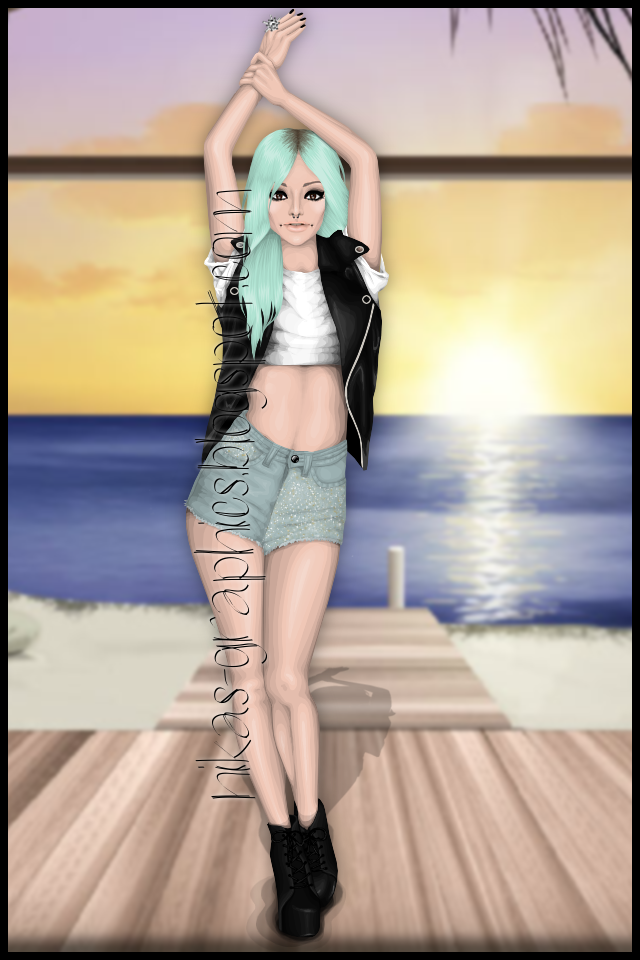
my latest graphic

Hello!
You may not remember me due to my absence here, and I'm reaaaaaally sorry for not posting anything at all. I was kind of busy with school and I didn't make any graphics anyways, so yeah. But hey, here I am now.

So if you're a follower of my blog, you may be aware of the fact that my tablet is broken, and it might take me quite a while to get a new one or whatever I'm going to do. So I've attempted to make a graphic with my mouse, which I've lastly done more than half a year ago, and here's the "result" or however you'd like to call it:


To be honest, I love the shorts, and I think the shoes turned out pretty good, but I'm not quite sure about everything else...
And yes, I know how odd the leg on the right looks, it wouldn't look as heavy if I was able to blend it. And I'm everything but a fan of the most basic leg shading, and I prefer that heavy leg over pretty much any totally basically shaded leg lol. 
I'd greatly appreciate every comment and any kinda criticism.

-Nika

29.5.12

Unfinished

So I was planning on working on a banner for my blog's upcoming makeover, however I kept on running into different obstacles (especially skin shading and hands), so I decided to give up. Maybe I'll finish it later and add it to my graphic's blog banner... but we'll just have to see.

I know, its ugly... the sad part is I love the dress, but it doesn't go at all with my medoll's complexion at all. Maybe I should just change my skin tone a tad so it'll be easier to work with for graphics and whatnot... she's ugly anyways LOL

Hair Practice

Nothing special, just working on some hair. I don't know if I like it, the gap looks odd between the shoulder and hair but meh it's only the hair I was working on. Excuse the body lol, it's a random outfit from the last Flora collection I had on my computer to stick the head onto. I'll work on this graphic a bit more and show you later, hopefully it'll look half decent then haha.


It sucks I know haha, but practice makes perfect I guess.

28.5.12

Header for Pin Up Model

I was asked for a header for Pin Up Model (it's russian blog). Here it is:
I'm not a huge fan of it, and I don't like the face (the model is Gmonster), but still, it isn't the worst graphic I made.
And, btw, I won't post anything in summer, 'cause I'm going to my country house. There's no connection with Internet, but I'll take my laptop & tablet there, so in the beginning of fall you'll get heaps of the graphics from me ;)

Comment, please.
-Maria

Super Copier X 100

Today I don't have any graphics for you, but I wanted to write about a person who you could call a "super copier." A while ago I followed this graphic designer thinking she had real potential (not that her graphics are "great"). I'm glad I did follow her blog because of something serious, something that we see daily... the infamous copying.

This user goes by the name of "ladymiszel12" and has a graphic blog showcasing many different graphics all supposed made by her... however that is definitely not the case. Take a look at various graphics she's stolen from different graphic designers.

(Click To Enlarge)

Though copying once isn't unusual, but copying almost every graphic-- now that's unheard of! Some she might have coincidentally used the same reference picture as others, but when almost every single detail looks similar, now that's just rude.

Have you ever been copied before? Let us know your take on plagiarism.
 Oh, and btw, sorry for the blurriness, I was using paint since I don't have much time to post.

27.5.12

Long time no post

Hey, it's Maria after being not writing for a long time. I just was very busy with my magazine, and now I'm almost free. I've just finished a graphic which I'll probably use for my graphics blog (which wasn't updated for ages):
Click to enlarge

What do you think? It isn't very summery, but I love it.

Comment, please. 
Maria xx

At the Beach!

I'm at the beach!


hehe;)


Not much to say about this graphic except:
I hate it and I want it to virtually die. It's a load of crap, to me anyways...

26.5.12

What I've Been Waiting to Show You!

While these are older and not as accurate as my current graphics, here are the graphic I made for splendid Magazine, which you'll find the link in Lindsey's post below! Hopefully, you guys like them, but if not...sorry?Haha.

The Best of them all, in my opinion;D

In my opinion, this and next one tie in second+third:)


Least favorite-because it looks rushed.
Enjoy, Mah' Darlins:D
(hehe, southern slang:))

Graphics For Splendid

Hello all!
If you aren't aware, the second issue of Splendid Magazine has just been released! I couldn't be more happy with the issue, especially all the hard work put into it! If you aren't aware, I was one of the graphic designers for this issue, and did work for the trends section and one of the two covergirl photo shoots.

 Take a look at my contribution to the magazine, and don't forget to see the rest of the issue HERE!

 (click to enlarge)
As you can see, this was part of the covergirl photo shoot. I had the head to an angle, however Maria replaced it with the stardoll-head version (if you get me). The original image I had to recreate had the model sitting on boxes, however for the magazine Lige ended up sitting on a stool instead.

(click to enlarge)
These are two out of the three graphics I did for the trends section (for some reason my computer is bad at saving things, so I don't have the orange trends graphic at the moment saved). I was pretty happy with the hair from the graphic to the left, though I love, love, LOVE the dress on the model to the right.

So, what do you think of these graphics? Comments are appreciated!

---------

Oh, and I also forgot to mention, I'm also a contestant for Survivor Season 2 on Underneath Stardoll, and so far have made it through the past two rounds, and I am waiting for results on the third task. Take a look at my previous entries!

Task 1 -- Click to Enlarge

Task 2 -- Click to Enlarge

Task 3 -- Click to Enlarge

Once again I apologize for being slow on graphics, but I finally have a whole summer for creation! Don't worry, new graphics will arrive shortly (lets hope!).

Yet another graphic stealer ...

Heya, sorry I haven't posted in a little while, here in Scotland, we've had good weather for like 3 or 4 days and it's set to stay good until at least Monday - if you also live here, you will know that it's unusual to have more than 1 good day of weather at a time, so you really have to make the most of it! I'm also moving on Wednesday, so I'm trying to sort and organise all my things to pack, so I don't think I'll have much time for graphics until the end of the week =( 

This post is about yet another individual (dubistdie) who has decided to copy one of my graphics - and she didn't even choose just a random one I'd made, she chose one of my entries for SDNTGD - way to make yourself more obvious!
Here's mine: 
And this is hers - it's her entry for Underneath Stardoll's Survivor Fashion:
To be honest I don't feel the need to describe what changes she's made, it's pretty obvious if you compare the two.

25.5.12

At the moment i'm working on graphics for magazine & blogs, which i can't post right now, but i did promise that i would post twice a week, so for now i'm just going to post one of my completed graphics. 
This one was done a month ago (i think) I've gotten a lot better since then, but i thought this was cute: 

23.5.12

Spring 2012 #2

I think my hair has improved since my last post. Although I'm not sure I like the bag, overall I'm pretty happy with how this has turned out =)
Love K xxx

Hello!

Hi, I'm Kimberly. You might know me I guess. I make graphics, which not many people know about actually, hehe. I'm on a slight break from Stardoll so don't expect too many graphics from me, but I will get back into the swing of things in July. :-)

Moving on, these are two sneak peaks from a graphic I just finished. It's for my magazine Loud and may be slightly blurry, apologies if they are! I'll probably make a random graphic sometime this week so I can show you a full one! Comments and critiques welcome. ;) xo

P.S: I tried to be jazzy with the two tone fade parts on the dress... Whadya'll think?!
BTW: I made this blogs banner if you wanna see another graphic of mine haha.


~Kimberly!

Just a quick post

I would first like to say i am so happy i get the chance to post on here, i love all the other graphic designers work. I'm still quite new at graphic, still trying to find the right techniques that suit me. So bare with me, but i hope you like what i post. 
This is a graphic i'm working on for HYPE Magazine, still not done yet but this is it so far. 

22.5.12

Spring 2012 #1

Click on it to enlarge.
I think the hair is improving in shape and shading, but I still need to work on a few areas.
This image is from a set of 8 and I plan on doing them all in an attempt to bring back my love and passion for graphics - if you've been watching ANTM: British Invasion, I'm kind of like Alisha and have lost my spirit for the work, and I really want to get that back.

K xxx

P.S. That's meant to be a stool that my doll is sitting on, I haven't mastered the art of wood!

Hired Designers

This was difficult because I didn't know who I wanted to choose. But then I thought who has potential and who I feel who can improve the most in their graphic designing so I came to the conclusion (with the help of Sparklewand12) of:

Xxlovexx
jem-n-em
Ashanty2012

Well done guys! Please contact me for more details!

Missceaaria

SDNTGD Task 4

Here's my task 4 entry:
I was pretty happy with it, for me it's an improvement(I made it before either of the Harper's Bazaar dresses).
I guess I'm lucky to have survived, but lets face it I will be eliminated next ...

20.5.12

Graphic for a spoiler

Hey dolls!, It's Khol,
I have an exclusive graphic to be shared, It's a recreation of Lady Gaga's 'Meat Dress' which caused a lot of controversy.
Of course, being 'Rebelle' Magazine, I had to include it for the upcoming GAGA ISSUE. yay.
so heres the spoiler -
btw it's me in the graphic :)

Whatcha think?

Love ya,
Khol X

Oopsy Daisy:)

Another graphic from the works of Kasey Noelle.
This was ANOTHER task 4 potential(with another model) but it didn't make the final cut.
HOPEFULLY, my entry DID do okay.
I worked super hard on it for about 10 hours (over the week combined)

So here is the graphic that got cut.
Click to Enlarge
The hair can go jump off a cliff and die. I hate it.
And the model is too skinny. I couldn't get her bigger without making her look like a spud, so I had to:(

a favorite of this graphic are the shies(AHH,love them.) and the clutch(AHH, it's okay...)


Enjoy!


18.5.12

Harper's Bazaar Dress

Love a spread from Harper's Bazaar Turkey, so that's been my recent graphic inspiration, the graphic of the header for SD Model News came from the same spread as this one did:


I really like it, I was going to change the colour of the dress as I'm not too big a fan of lime green, but I actually like how it looks - yay =)

Love K xxx

17.5.12

What Was I thinking?

Hola!:D

Here's the oh-so-ugly graphic I was ORIGINALLY going to send in to SDNTGD!
What was I thinking?


I changed the color of the dress for personal reasons.
 Now, instead of plain white, it's the trendy MINT!
Heels are a disaster, the belt is pathetic, don't even get me started on the hair!
Oi.

Oh well, the new graphic I'm making is Sooooo much better(In my opinion!)
Hopefully you guys will see it soon and HOPEFULLY, I'll continue through the competition.


Okay, that's all. 
Thanks for reading:)

16.5.12

Graphic

So I decided to work on a header with a graphic for my new blog, and used the hair and head that I posted earlier tonight:


I'm not sure what to think, I do quite like it, but part of me thinks it looks a bit odd! But oh well, I think it looks good on the blog!

Love K xxx

Heya =)

Hey, so my exams are finally finished!!! Yay - except the last one this morning was horrible and I didn't finish it, but still, I'm FREE!!!
Was making a graphic, but then decided I didn't like the clothes, and couldn't be bothered finishing it, but I really think I'm starting to improve with my hair, so though I'd show you anyway =)

Love K xxx

P.S I'm thinking about buying an iPod touch, and just wondered if anyone who had one could let me know what they think about them, how easy they are to use, and anything you might think I should know before buying one. I'm quite set on an iPod touch, but my dad wants me to consider other tablet devices as he thinks I would find one of them more useful, I did quite fancy a Kindle Fire, but it could be a while until we see them here in the UK =(

15.5.12

It's been Too long!

Greetings y'all, yes it has been too long since I posted a graphic. (TOO LONG!) But the news gets worse, since I am working on major projects of late, you will not be seeing any graphics besides spoilers & some sneak peaks for around 6 months+!! I am truly sorry! But if you want a big surprise when it/they? come out, it will be worth it... For extra sneak peaks - add me on skype at ICONagency, because I often ask for opinions on them. But of what most of you don't know is that, I have improved, I mean like, heaps! (btw I am not leaving) I will still post spoilers and some little sneak peaks, xoxo Lige

Hiring (Again)

Long time no see! I log onto stardoll everyday, but I have absolutely no time for graphics, which is sad cause I really enjoy making them!

I decided to hire some new writers as some had left, many people have been asking to join and we need some new creativity here. Just fill in the form below and I'll get back to you:

Username:
Example of graphics:
How often will you be able to post?


MissCeaaria

14.5.12

Stardoll Hair Tutorial Video


Hope you enjoy! I've thought its about time to do a hair tutorial :)

12.5.12

Elegant Red Dress/Medoll Change

I made a new graphic in between working on my SDNTGD task.
It's okay, but tell me what you think!
The main feature of this graphic is the dress:)


So? Whatcha think?

Also: I changed my medoll's eyes and eyebrows from the previous. I think I prefer the one above, over this one:


9.5.12

I Really am Starting to Suck...

It seems like my graphics are going downhill.
I seem to be making amazing graphics for the magazine I'm working at, but really suck-ish ones for SDNTGD.
Here's my graphic from the most recent task.


I really need to get my A-game back. I started this thing in first place and that's where I intend to end. It isn't that I think Lindsey or someone else deserve it less than I, because if anything, they deserve it way more. 
I just really wanna show them what I'm made of.

Here's a recent graphic I've done. It's nothing compared to the past few graphics I've made, but it's better than others.


I would love it if you guys could give me some encouragement. Something to raise my spirits.

Pwease?;]


8.5.12

Task 3 SNTGD Entry

Yeah, yeah. Another post regarding stardoll's latest graphic design contest, Stardoll's Next Top Graphic Designer. This time, we were assigned to make a summery banner for TTT. I doubted I'd win this task, since I wasn't much of a fan of it... but you know what? The judges loved it. I was incredibly astounded-- regarding the fact that I wasn't pleased with my entry. Nevermind that, I'll reveal it to you anyways :)

(click to enlarge)
Model is Kim (xxlovexx)

Comments, suggestions or critique? Let me know in comments!
BTW, I will be showing you more graphics soon... if you didn't know, I am now a contestant for Survivor-- Fashion Edition Season 2 on Underneath Stardoll! I hope to include my graphic-itizing skills within the competition!

Task 3 Entry for SDNTGD

Hey, so here is my task 3 entry:

My favourite part was defs the dress, and I think it was important for me to do a full body clothed as I was yet to show that in my entries.
I got pretty good comments for me, so I'm pretty happy with it, and I'm not eliminated(Woohoo!) because someone pulled out.
I think overall the one I was going to do(see my last post, here) would have been an amazing entry, but with my time constraints because of exams, I'm happy with what I entered =)

Can't wait to see the next task!
Love K xxx

7.5.12

Guess Who No. 2

After yesterday's recreation of a celebrity, I fell in love with the idea! That's why I've attempted with a second celeb, though it still isn't completely a look-alike, its much easier to tell because of the vibrant red hair. Can you tell who this actress is?


I love, love, love the hair, its very exaggerated, though I guess I just like that style. I will be getting back to stardoll graphics soon, but I'm working on some that I can't reveal just yet.

Anyhow, can you guess who this new person is? Comment below!

6.5.12

My task 2 NTGD entry

sorry it's late!, here's my entry for last weeks task for Stardoll's NTGD,
I was portraying lust, what do you think?

Commission for Mariakakas


Hey everyone! It's been so long since I made a proper graphic.
I've been busy with school and stuff, you know.
The model is Mariakakas. She asked to do the banner from a specific photo, so I'll post that too.
This is just the graphic part of the banner.


-Lilyqi 

5.5.12

Guess Who

After much debating, I've decided to create a story on Wattpad. After going through a cast list in my mind, I've decided on a certain someone to be the main character.

I am going to show you this much, but you have to guess who the celebrity is (I know, it looks nearly nothing like her, but oh well...).

Who is it?

Edit: Here is the final version of my wattpad book!

4.5.12

My New Google Profile Picture

Here's a recent graphic I made in between projects. It's for my Google profile picture.
Give me your comments.


The graphic originally a bigger one, but I made it smaller.
The focal point is supposed to be the hair, but it isn't,really.
The hand could use some work, but that's about it.
Comment?

UPDATED:
I re-did the face. Explanation:
My original edited face was not nearly as horrible as that one above. I only had about 5 minutes before I posted this, till I went out for dinner with some people.
I quickly attached this pre-edited face.
Here's the newer version:


The makeup is smokey-er, the cheek bones are exaggerated, but high. and the nose is nice. I did nothing to the lips because they are meant to be nude.
Better? or worst?
If you also notic, I returned to my original Idea of having the hair behind the shoulder. I think I like this one more than before.