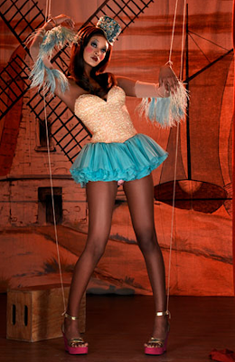
Okay...
This totally stunned me, but I was chosen as the top photo of the week!
Oh My GOD.
I am absolutely freaked out! Everyone seemed to of done SO MUCH better than I did!
I just couldn't believe it!
Now, Here's my entry for the contest:


I think the judges chose your entry as best because of the stunning details! I hardly see any flaws to the graphic, and everything flows so nicely together! Bravo, Kasey! Can't wait to see task 2's entry from you! :)
ReplyDeleteThank you! I spent about twelve hours on it in total! I'm glad it paid off! Your's was SO beautiful! I loved the dress and hair!
DeleteAw, thank you :) Haha, I'm now working on task 2 (nearly finished with medoll part!!) and its taken me all day (about 12-14 hours... haha)! Good luck on your graphic ;
DeleteIt's truly amazing. Keep going this way.
ReplyDeleteThank you!:)
DeleteWow! It is amazing and I love the fact that you made it look like a puppet :) You are very talented :)) Good luck for the rest of the contest :))))))))
ReplyDeleteI like it! The only thing I would've changed is no hat.
ReplyDeleteThe hat is needed. It's part of the original picture, which is what I'm trying to portray. and Thanks!
DeleteThe hair needs some work, but overall good job :]
ReplyDeleteI can see that you are improving :]
The hair is the best replica I could make of the original. Everyone says it needs improving, but it doesn't. It's either this, or the sucky other version. And thanks...
DeleteThis comment has been removed by the author.
ReplyDeleteYou could of created a different hairstyle :]
ReplyDeleteYou didn't have to copy it from the pic.
Uhm...Whatever. :)
DeleteThey look very similar! But I think the hat looks kinda flat. It is brilliant though! I love the tutu! It looks so realistic! And I love the fact that you used the same background, but blurred it! <3
ReplyDeleteYeah. I wanted the focal point to be the model and the tutu is also my favorite. I spent two hours on that baby! The bottom could be darker, though.
DeleteNo, I think it is okay the way it is! I would never be able to do that! To be honest, I think I don't put enough detail in my graphics! It sounds really strange..... But if I were you I would keep it the way it is! It is beautiful
Deleteugg boots clearance
ReplyDeletetrue religion jeans
uggs outlet
michael kors outlet
true religion outlet
louis vuitton handbags
ugg australia
michael kors outlet online
coach outlet
prada sunglasses
kate spade uk
ralph lauren outlet
ray-ban sunglasses
camisetas futbol baratas
jordan 4
soccer jerseys
hollister clothing
ray ban sunglasses
links of london
longchamp outlet
michael kors handbags
michael kors outlet clearance
michael kors handbags clearance
ralph lauren outlet
ugg boots sale
lululemon uk
michael kors outlet
true religion jeans
ralph lauren polo shirts
air jordan 11
michael kors outlet
oakley sunglasses
canada goose outlet store
ralph lauren polo
mulberry sale
20160826caihuali
ugg boots
ReplyDeleteburberry outlet store
coach outlet store
coach handbags outlet
cartier watches for sale
michael kors outlet
asics,asics israel,asics shoes,asics running shoes,asics israel,asics gel,asics running,asics gel nimbus,asics gel kayano
uggs on sale
prada handbags
beats headphones
true religion outlet
polo outlet
ghd uk
nfl jerseys
michael kors handbags
louis vuitton handbags
fitflops sale
dior sunglasses
michael kors uk
ray ban sunglasses
michael kors outlet online
prada sunglasses
louis vuitton
coach outlet
prada sunglasses for women
ray-ban sunglasses
coach outlet online
futbol baratas
ray ban sunglasses
adidas outlet
uggs outlet
louis vuitton
true religion outlet uk
abercrombie outlet
longchamp handbags
chanyuan0826